Ed’s art career had its roots in junior high school, where he doodled
so much in his text books that he had to pay for some of them at
the end of the school year. To prevent this problem from
reoccurring in high school, he started to carry a small sketchbook to
doodle in. Without having to frequently change pages to keep up
with the teacher, he started to spend more time on each page, and
his interest changed from patterns to drawing faces. He graduated
from ball point pens and pencils to technical pens, and then to using
color inks. Although he didn’t feel like his work was particularly
good, he kept getting high grades in art, and took all the high-
school art courses he could just to get easy “A’s” at Central High
School in Philadelphia, PA. His work advanced to the point where he
was accepted with a scholarship at the Philadelphia College of Art
(PCA) (now University of the Arts).
Ed entered PCA in 1971, at the age of 17, as a
film-making major, and later switched majors to
environmental design, but his most lasting
inspiration from his time there came from drawing
teacher David Kettner, who drew small amazingly
complex mandalas. Although they were beautiful,
Ed was totally awed by the amount of time
evidenced in such a small space. He also gained
many other insights from Kettner’s perrenialist
teaching style, where he would often quote the
same platitudes about art in his discussions.
Frequently in his class you would hear students
having “a-ha” moments where the insights that
were being offered where taken in. A couple examples of these insights are … "Gray is the enemy of
the painter" (Delacroix), and, “There are no lines in nature, only areas of color, one against another”.
(Edouard Manet).
Ed left PCA after a year because he did not know what he wanted to do.
After traveling around the United States on his motorcycle, he took a job
working nights at the post office because this allowed him to pursue his
creative endeavors. When he witnessed the working conditions there,
this lead him into a 20-year span as a union activist, which while not
completely taking all of his creative energy – it took much of it. The
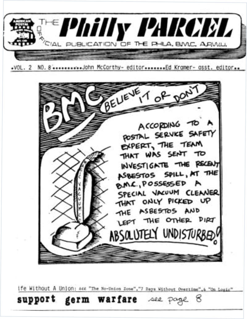
newsletter that Ed created, edited, designed and produced won the
"Overall Best Newsletter" Award from a trade organization with hundreds
of member publications in 1983.
During this period, in the 1970’s, his artistic interest
moved towards explorations of patterns of lines and the
way that different patterns interacted. In the visual
language that developed, horizontal and vertical lines
could represent any dichotomy (good and bad, right and
wrong, etc.). Solid shapes represented fixed ideas,
progressions of lines and patterns are the layers of
complication that effect these basic forces.
He was fascinated by M.C. Escher’s paradoxical
geometric form drawings, and with the many variations
of patterns that could be created with simple colored
lines (repetition, progression, randomness, and all their
variations and combinations). His work also explored the
concepts of assimilation and contrast that were the basis
of Op Art. (Assimilation is the attempt by the brain to
group similar appearing objects, and contrast is the
attempt by the brain to place a shape in either the
foreground or the background of a picture.) Although he
could not see his own work “all of the way though”, he
got much feedback from others about the mind-
bogglingly deep spaces that were created by his work.
During one of his frequent trips to the art museums in
Washington D.C., he had the first “peak” art experience that
moved him towards the artistic vision that he holds to this day.
There was a painting in the Hirshhorn Museum, which he
initially walked right past. When he came back around to it (it is
a round museum) there were several people making a fuss over
it. Although the canvas appeared to be all red, with no other
markings what-so-ever, after looking at it for a short period of
time, oval shapes were clearly seen that were moving through
the picture space – not only two dimensionally, but most
amazingly, in the third dimension as well. Later when
researching this phenomenon, he learned that the human eye
only has so many sensors for each color, and when the sensors
get overwhelmed, the brain knows that there is more
information, so it starts to essentially make things up.
A few years later, in 1977, also at the Hirshhorn, he experienced the
most profound artistic experience of his life (to date) at the Kenneth
Noland Retrospective. Noland is known for his “target” paintings
that some people ridiculed at the time. There were many target
paintings in the show, as well as other works featuring sharp angles.
To that point Ed’s typical experience with Noland’s painting had
been for the different color bands to optically mix. (For example a
reddish line and yellowish line would start to appear as one orange
line). While your brain processes this, it "flashes" back-and-forth
between seeing two lines and one, and causes other unusual and
interesting visual effects, such as perceived movement and the
illusion of depth. But that day one of the paintings produced an
exponentially greater effect. First the bands optically mixed, and
then the light colored center turned dark – then black. Even at that
point it was an amazing experience, but then the, now dark, core
started to spin, and then radiant light emanated from behind the
spinning black disk. Again at that point it was the most amazing
visual experience of Ed’s life – but then it reached a much higher
level … the edges of the painting disappeared, and the view became
like viewing a solar eclipse at close range. (Check out
http://www.kennethnoland.com/.)
Ed never experienced another painting to that level again, but it did
inspire him. He embraced the idea of a higher level art experience that
would not require any previous, or culturally specific, knowledge of art to
appreciate – but one that was enabled by pushing the limitations of
sensory capabilities. He started to work larger – substituting permanent
markers for technical pens, in much of his work, and increasing his focus
on the power of color. The work of this period culminated in a one-man
show at the Sage Gallery in Gladwyne, PA in 1985. Unfortunately, he
learned the hard way over the next decade that permanent markers are
not permanent at all, particularly the reds and yellows.
The 1990’s were devoted to family life, but he continued to draw and paint
(paying great attention to the permanence of his materials).
A woodworking project he designed and built, that features many of the
same visual ideas as his art, is featured in the book "Handmade Houses" by
Steven Paul Whitsitt and Tina Skinner (Schiffer Publishing, 2008).
During the creation of a painting in 2012,
now entitled “Letting Go”, Ed became
fascinated with creating layers that could
not be processed visually simultaniously.
(That is when you focus on one layer,
another layer all but disappears.) This lead
to a new appreiation of Islamic art and
“sacred geometry” and their property of
having one design that can be visually
decoded different ways.
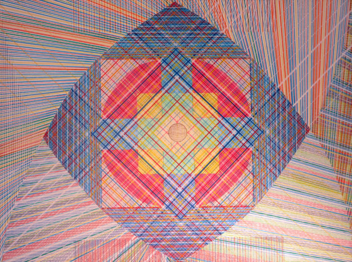
The vast majority of Ed’s artistic efforts
since have focused on star designs.


 (Hendrix portrait) - 1974")


E D K R A M E R A R T B I O


Ed’s art career had its roots in
junior high school, where he
doodled so much in his text
books that he had to pay for
some of them at the end of the
school year. To prevent this
problem from reoccurring in
high school, he started to carry
a small sketchbook to doodle
in. Without having to frequently
change pages to keep up with
the teacher, he started to spend more time on each
page, and his interest changed from patterns to
drawing faces. He graduated from ball point pens
and pencils to technical pens, and then to using
color inks. Although he didn’t feel like his work was
particularly good, he kept getting high grades in art,
and took all the high-school art courses he could
just to get easy “A’s” at Central High School in
Philadelphia, PA. His work advanced to the point
where he was accepted with a scholarship at the
Philadelphia College of Art (PCA) (now University of
the Arts).
Ed entered PCA in 1971, at the age of 17, as a film-
making major, and later switched majors to
environmental design, but his most lasting
inspiration from his time there came from drawing
teacher David Kettner, who drew small amazingly
complex mandalas. Although they were beautiful, Ed
was totally awed by the amount of time evidenced in
such a small space. He also gained many other
insights from Kettner’s perrenialist teaching style,
where he would often quote the same platitudes
about art in his discussions. Frequently in his class
you would hear students having “a-ha” moments
where the insights that were being offered where
taken in. A couple examples of these insights are …
"Gray is the enemy of the painter" (Delacroix), and,
“There are no lines in nature, only areas of color,
one against another”. (Edouard Manet).
Ed left PCA after a
year because he
did not know what
he wanted to do.
After traveling
around the United
States on his
motorcycle, he
took a job
working nights at
the post office
because this
allowed him to pursue his creative endeavors. When
he witnessed the working conditions there, this lead
him into a 20-year span as a union activist, which
while not completely taking all of his creative energy
– it took much of it. The newsletter that Ed created,
edited, designed and produced won the "Overall Best
Newsletter" Award from a trade organization with
hundreds of member publications in 1983.
During this period, in
the 1970’s, his artistic
interest moved
towards explorations
of patterns of lines
and the way that
different patterns
interacted. In the
visual language that
developed, horizontal
and vertical lines
could represent any
dichotomy (good and
bad, right and wrong,
etc.). Solid shapes represented fixed ideas,
progressions of lines and patterns are the layers of
complication that effect these basic forces.
He was fascinated by M.C. Escher’s paradoxical
geometric form drawings, and with the many
variations of patterns that could be created with
simple colored lines (repetition, progression,
randomness, and all their variations and
combinations). His work also explored the concepts
of assimilation and contrast that were the basis of
Op Art. (Assimilation is the attempt by the brain to
group similar appearing objects, and contrast is the
attempt by the brain to place a shape in either the
foreground or the background of a picture.)
Although he could not see his own work “all of the
way though”, he got much feedback from others
about the mind-bogglingly deep spaces that were
created by his work.
During one of his
frequent trips to the
art museums in
Washington D.C.,
he had the first
“peak” art
experience that
moved him towards
the artistic vision
that he holds to this
day. There was a painting in the Hirshhorn Museum,
which he initially walked right past. When he came
back around to it (it is a round museum) there were
several people making a fuss over it. Although the
canvas appeared to be all red, with no other
markings what-so-ever, after looking at it for a
short period of time, oval shapes were clearly seen
that were moving through the picture space – not
only two dimensionally, but most amazingly, in the
third dimension as well. Later when researching this
phenomenon, he learned that the human eye only
has so many sensors for each color, and when the
sensors get overwhelmed, the brain knows that
there is more information, so it starts to essentially
make things up.
A few years later, in
1977, also at the
Hirshhorn, he
experienced the most
profound artistic
experience of his life (to
date) at the Kenneth
Noland Retrospective.
Noland is known for his
“target” paintings that
some people ridiculed at
the time. There were
many target paintings in
the show, as well as
other works featuring
sharp angles. To that
point Ed’s typical
experience with Noland’s
painting had been for
the different color bands
to optically mix. (For
example a reddish line and yellowish line would start
to appear as one orange line). While your brain
processes this, it "flashes" back-and-forth between
seeing two lines and one, and causes other unusual
and interesting visual effects, such as perceived
movement and the illusion of depth. But that day
one of the paintings produced an exponentially
greater effect. First the bands optically mixed, and
then the light colored center turned dark – then
black. Even at that point it was an amazing
experience, but then the, now dark, core started to
spin, and then radiant light emanated from behind
the spinning black disk. Again at that point it was
the most amazing visual experience of Ed’s life – but
then it reached a much higher level … the edges of
the painting disappeared, and the view became like
viewing a solar eclipse at close range. (Check out
http://www.kennethnoland.com/.)
Ed never experienced another painting to that level
again, but it did inspire him. He embraced the idea
of a higher level art experience that would not
require any previous, or culturally specific,
knowledge of art to
appreciate – but one
that was enabled by
pushing the limitations
of sensory capabilities.
He started to work
larger – substituting
permanent markers for
technical pens, in much
of his work, and
increasing his focus on
the power of color. The work of this period
culminated in a one-man show at the Sage Gallery in
Gladwyne, PA in 1985. Unfortunately, he learned the
hard way over the next decade that permanent
markers are not permanent at all, particularly the
reds and yellows.
The 1990’s were devoted
to family life, but he
continued to draw and
paint (paying great
attention to the
permanence of his
materials).
A woodworking project he
designed and built, that
features many of the same
visual ideas as his art, is featured in the book
"Handmade Houses" by Steven Paul Whitsitt and Tina
Skinner (Schiffer Publishing, 2008).
During the creation of a painting in 2012, now
entitled “Letting Go”, Ed became fascinated with
creating layers that could not be processed visually
simultaniously. (That is when you focus on one
layer, another layer all but disappears.) This lead to
a new appreiation of Islamic art and “sacred
geometry” and their property of having one design
that can be visually decoded different ways.
The vast majority of Ed’s artistic efforts since have
focused on star designs.
 (Hendrix portrait) - 1974")


E D K R A M E R A R T B I O


K r a m e r A r t . n e t